WhiteFrontier Brewery
- Branding | Label design -
Client : WhiteFrontier Brewery
-
Graphic Design
Typography
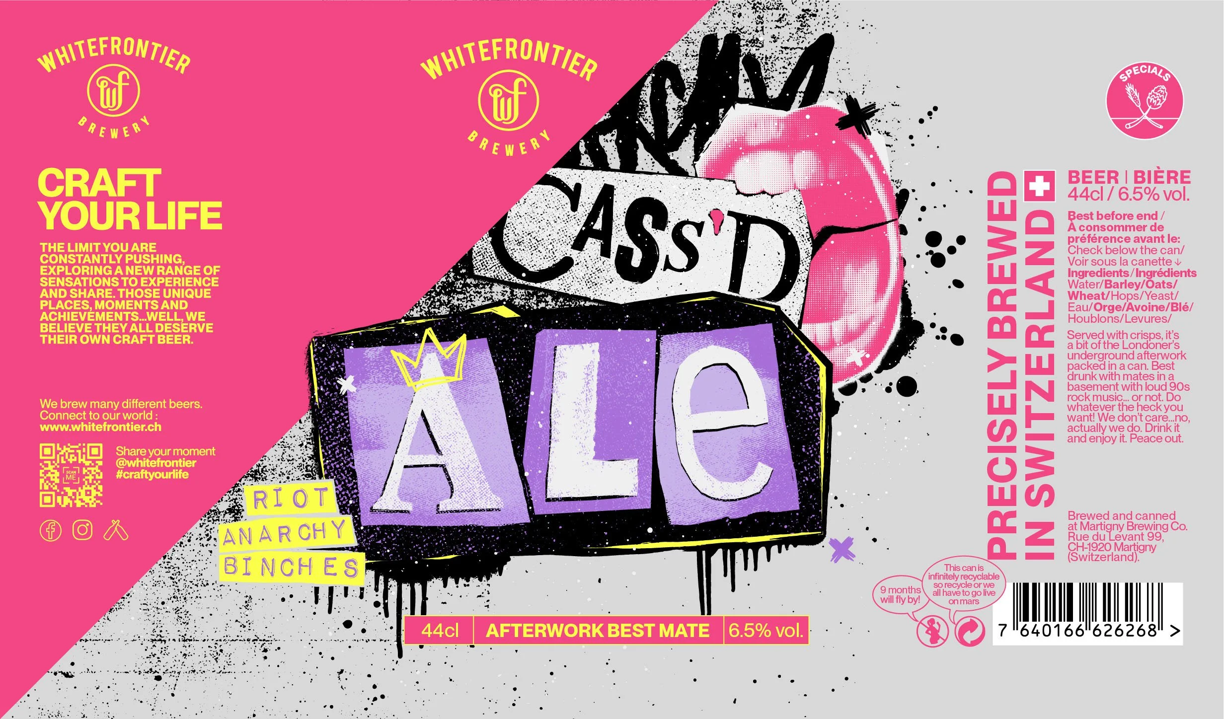
This project was developed as part of a beer label design contest for WhiteFrontier Brewery, based in Valais, Switzerland. WhiteFrontier was seeking fresh visual approaches for a new beer. My proposal was a bold, punk-inspired label design that would capture the essence of a British Ale. The idea was to use mostly typography to create a distinctive visual identity for the product while staying true to the brewery’s values.
Although this concept did not move forward, it remains a strong exploration of how beer label design can merge branding, storytelling, and illustration into a striking and memorable product.
Challenge
The brief required a label design that could stand out in a competitive craft beer market while remaining authentic to the WhiteFrontier brand. My concept needed to combine British punk heritage, a distinctive and eye-catching look and the modern creativity that defines the brewery. At the same time, it had to speak to both craft beer enthusiasts and a broader audience. Finding the balance between bold graphic design experimentation and coherent visual identity was at the heart of this pitch.
Solution
My approach was to use a punk-inspired graphic style with expressive textures, graffiti elements, and a bold, playful typography treatment. The word “ALE” was designed as a blocky collage, recalling the raw energy of DIY poster culture. Bright accents of pink and purple contrasted with grittier textures, creating visual tension and energy on the can. This mix gave the label design a rebellious personality while making it instantly recognizable on the shelf.


