#HELVETICA
- Title sequence | Art direction & Motion -
Client : RTS (Radio Télévision Suisse)
RTS Creative Dir. : Franck Jacquemettaz, François Rosé
Produced by Vandy Studio
Typeface created by NewGlyph
-
Art direction
Motion design
Graphic design
Oliver and Nicolas Jutzi, the founders of Vandy Studio, invited me to collaborate on an exciting project with RTS, the Swiss public broadcasting organization. My role was to design and animate the title sequence for an upcoming TV show.
The show centers on in-depth interviews with prominent Swiss figures, offering a unique exploration of the guest’s own domain. Spanning a wide range of topics—politics, economy, society, sports, and culture—the hour-long conversations are hosted by journalist Philippe Revaz.
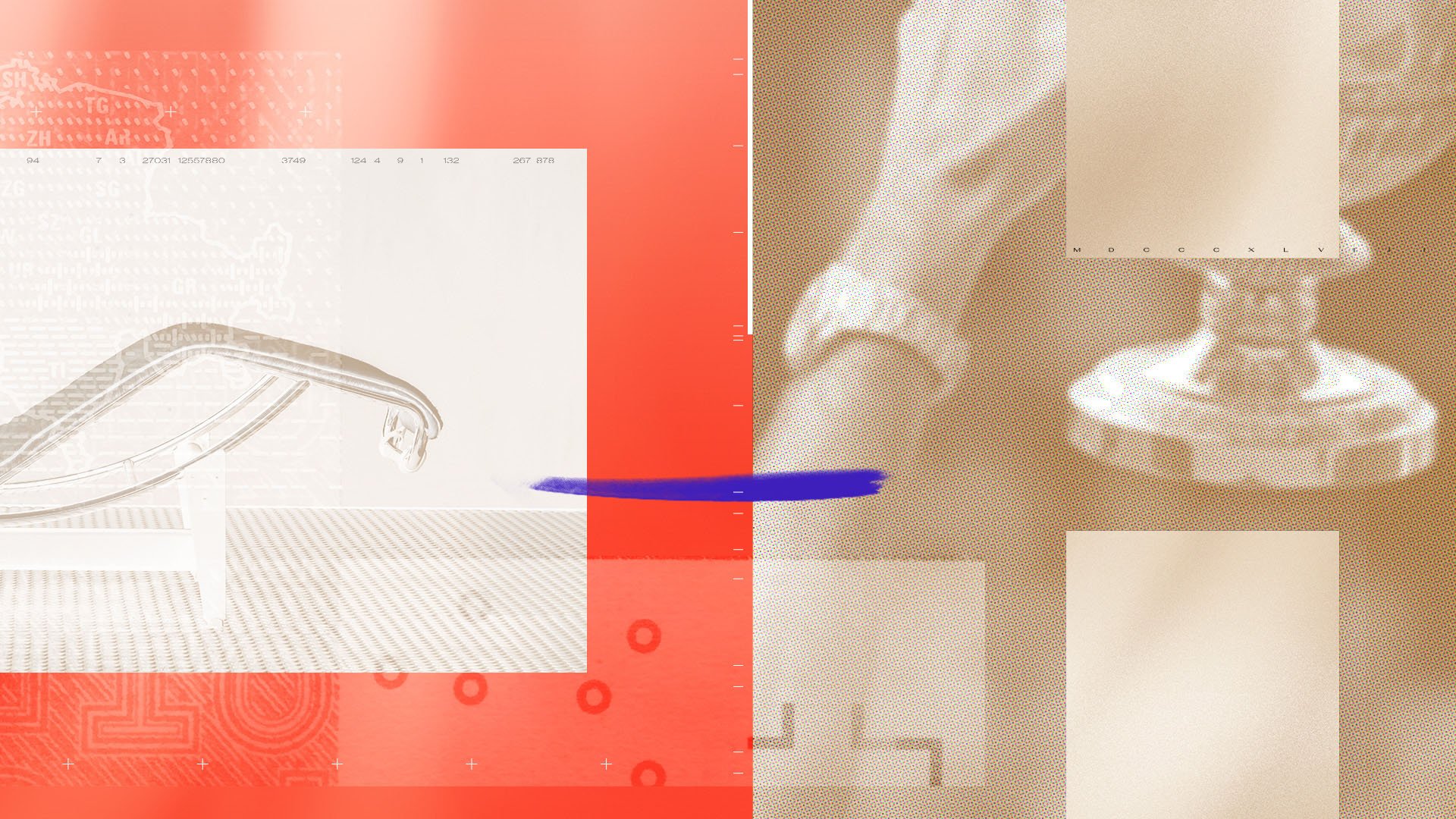
As I joined the project during production, I was briefed on the client’s vision and the progress already made. Key components were the visuals for the background screens used on set. Building on these assets, I crafted a series of styleframes to demonstrate how the background graphics could be adapted for the title sequence.
Once the designs were approved, I animated the sequence in close collaboration with Oliver, Nicolas, and RTS Creative Directors. They envisioned a dynamic and impactful animation, incorporating iconic Swiss symbols to reflect success and modernity.
To complement the visuals the Antarctica font was chosen. This is a beautifully crafted Swiss typeface designed by NewGlyph, a Lausanne-based studio specializing in type design. This typeface leverages variable font technology, enabling a seamless exploration of weights, widths, and styles. The variable feature not only anticipates the evolving demands of digital design but also allowed us to create smooth, flowing animations between typographic styles.
For a type nerd and motion designer like me, working on this project was a treat. The smooth collaboration between RTS, Vandy Studio, and me made the project a joy to work on - and that energy really shines through in the final result.


